
Designers know that design is more than just a good look. The design also covers how users interact with the product, be it a website or an app. It is like a conversation. Navigation is a conversation. Because it doesn’t matter how good your site or app is if users can’t get their bearings.
Why is bottom navigation so important?
Stephen Huber discovered in his research on mobile device use that 49% of people rely on a single thumb to get things done on their phones. In the figure below, the diagram shown on the screens of mobile phones is an approximate access scheme, where the colours indicate areas that a user can reach with the thumb to interact with the screen. Green indicates the area that the user can easily reach; yellow, an area that requires stretching; and red, a region that requires users to change the way they hold the device.

It is important to place the most commonly used top-level procedures at the bottom of the screen because it is conveniently accessed through one-thumb interactions.
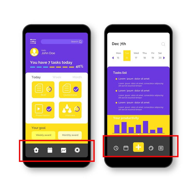
Tab bar
Many applications follow this rule and use the bottom navigation bar (also known as the tab bar) to get the most important functions from the application. Facebook provides the main parts of the basic functions with a single click, allowing a quick change between functions.
3 critical moments for bottom navigation design
Mobility is generally the vehicle that takes users where they want to go. Bottom navigation should be used for higher-level destinations of similar importance. These destinations require direct access from anywhere in the application.
A good bottom navigation design follows these three rules.
1. Show only top destinations
Use three to five top-level destinations in the bottom navigation. If there are three destinations, consider using tabs.
Avoid using more than five destinations in the bottom navigation because the click targets will be very close to each other. Placing too many tabs on the tab strip can physically make it difficult for people to click the tab they want. And with each additional tab it displays, it complicates your application.
If your top-level navigation has more than five links, provide access to links not covered in the bottom navigation through alternative locations.
Avoid scrollable content
Partially hidden navigation is a fairly straightforward solution for small screens – you don’t need to worry about limited screen space, just put your navigation options on a scrollable tab. But scrollable content is less efficient as you have to scroll once before you can see the option you want.
2. Report current location
Lack of indication of the current location is perhaps the most common single error that can be seen in application lists. “Where I am?” this will be the basic questions that users should know where he was?
Users must know how to move from point A to point B based on the first glance and without any orientation from the outside. You must use appropriate visual cues (symbols, labels, and colours) so that navigation does not require explanation.
Icons
Since the navigation actions at the bottom are provided as icons, they must be used for content that can be properly linked to the icons. There are universal icons that users are well aware of, most of which are functions like search, email, print, etc.
Unfortunately, “universal” icons are rare. Application designers often hide functions behind icons that are difficult to recognize.
I highlighted this issue in the article icons as part of great user experience.
Colour
Avoid using different coloured icons and text labels on the bottom tab bar. Instead, use the application’s base colour to indicate focus in focus.
Follow a simple rule: the colour of the current bottom navigation action (including the icon and any existing text labels) in the application’s base colour.
If the bottom navigation bar is coloured, make the icon and text title for the current action black or white.
Text labels
Text labels should provide short and meaningful definitions of navigation icons. Avoid long text labels because these labels are not cut or wrapped.
The items in the list should be easy to remove. Users should be able to understand exactly what happens when they click on an item.
The required size
Make the targets large enough to click or click easily. To calculate the width of each bottom navigation, divide the width by the number of shares. Instead, have all the bottom navigation actions show the most important action.
The Android Guide suggests the following dimensions for the bottom navigation bar on mobile devices.
The tab on the tab
You can display a badge on the tab strip icon to indicate new information related to this offer or situation.
3. Make navigation intuitive
Good navigation should be seen as an invisible hand that guides the user during his journey. After all, even the coolest feature or the most engaging content is useless if people can’t find it.
Behavior
Each bottom navigation icon must lead to a target, and menus or other pop-ups cannot be opened. Clicking on the bottom navigation icon should direct the user to the linked view, or update the currently active view.
Do not use a tab bar to give users controls to act on items in the current screen or application mode. If you need to provide controls, use the toolbar instead.
Strive for consistency
When possible, show the same tabs in each direction. It is better to give users a sense of visual stability by providing the same tabs in all directions.
Do not delete a tab when its function is not available. If you remove a tab in some cases and not others, it makes your application’s user interface unstable and unpredictable. The best solution is to make sure that all tabs are enabled, but explain why the tab content is not available. For example, if a user does not have offline files, the Offbox tab in the Dropbox app will display a screen that explains how to get them. This feature is called an empty case.
Hide it
If the screen is a scrolling summary, the tab bar can be hidden when people scroll for new content and reveal whether they start to drag down trying to get back to the top.
Visual delight
Avoid using lateral movement to move between views. Transitions between active and inactive views must use fade animation.
Takeaway
Navigation should be the bottom.
- Visible and well organized (use three to five top-level destinations and avoid scrollable content in the bottom navigation).
- Clear (the ribbon elements should be easy to erase and the targets should be large enough to be easily clicked).
- Simple (make sure each navigation icon leads to the correct destination and use all items, including bottom navigation, continuously in your app).
Conclusion
Helping users navigate should be a priority for almost all sites and all applications. The goal of these moments is to create an interaction system that naturally aligns with the user’s mental models.
You are designed for users. Always think about your own user personality, think about the goals you have when you use your app, and use your mobility to help them achieve those goals. The easier your product is to use, the more likely you are to use it.
